Ever been browsing a website on your phone, attempting to access some piece of information you’re interested in or navigate the menu, only to find the buttons far too small, or the dimensions of the images too large, or the scrolling just not working as it should?
You abandon the website in frustration and move on to a site that actually works.
The above description’s a horror story for any business wanting more eyes on their site and more sales through mobile. But it’s exactly what a customer will do if your website’s like the one above and doesn’t have a responsive design. Though it might look fantastic on your desktop, it’ll perform terribly on a mobile or tablet. But what is responsive design? And why should you care about it?
What is responsive design?
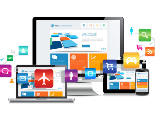
Responsive design is a web design approach that aims to make your website look good regardless of whether it’s viewed on a desktop computer, mobile or tablet. If you want to test if a website’s responsive, have a go at resizing your browser. If the images and text scale and shrink to fit the changed browser size – bingo, you’ve got a responsive site. For a nice example, take a look at our homepage.
The beauty of having a website that’s been designed responsively is you don’t need to create a separate mobile site or app to give your customers a good experience on their smartphone. As we’ve written about before, a separate site for mobile can pose a risk to your website traffic and SEO. Responsive web design takes out that risk, reducing the costs associated with building an entirely new mobile site or app.
Coined by Ethan Marcotte in 2010, responsive design has steadily grown in prominence. If you didn’t get around to it yet, don’t stress – we’re here to help you make 2018 the year of increased traffic, improved conversion and a better mobile experience for your business.
Why responsive?
Tthere’s a big market of people looking for business content on their mobile out there. But there are other reasons responsive design is desirable for your website.
Firstly, and quite simply, responsive is what everyone is doing or will soon be doing. We talked above about testing if a site’s responsive – have a go at testing out your closest competitors. If they are responsive, you have catching up to do. If they’re not, you’ve got a chance to get ahead of the curve and make your mobile or tablet experience much more powerful than theirs and draw eyeballs off their site and onto yours.
You also want to make things as absolutely easy for your customers as possible. Less barriers to sale means your conversion rate goes up. When customers bounce off a webpage simply because a contact number can’t be seen in the first three seconds, you want to make your mobile experience as stellar as possible. Make things easy, keep your customers on your mobile page, and convert them. Simple.
Finally, making your page responsive gives you greater control over how it appears to your customers. If the call-to-action is the most important thing you want your customer to see, you can make sure they see it with a responsive site. If you leave your mobile to resize the site of its own accord, you’re not able to control the order and size of content seen by your potential customers.
The results speak for themselves
Some of the conversion rate increases after an update to a responsive website are truly impressive. US brand State Farm received a 56 per cent conversion rate increase, Bench had a 100 per cent increase in conversion rate, while equestrian equipment supplier Horze increased mobile conversion by 19 per cent after going responsive.
What about apps?
Through this you might be thinking – responsive design sounds well and good, but what about mobile apps? Do you need responsive design, or an app, or both? The answer really depends on the nature of your business, as they both do different things.
An app needs to provide a different experience to your website, and give the customer more. Sometimes it’s difficult to determine what that extra something might be, and for a lot of businesses there’s no real need to go to the level of creating a dedicated app to do a job adequately achieved by your website.
Our advice is to focus first on responsive design. It’s a lower-hanging fruit that more readily sees results without having to plug time and money into building a standalone app. In 99 per cent of cases, a business should focus on having a fantastic mobile website experience before turning their thoughts to a mobile app.
This isn’t to say that apps are any less worthwhile – indeed, around one hundred billion apps were estimated to be downloaded in 2013, a fertile ground for businesses – but that responsive design should come first.