One of the key factors in keeping traffic on your site is making sure you have a solid navigation system. There’s nothing more frustrating than landing on a page and not knowing your way around it.
In a HubSpot survey, they found 76 per cent of online users said the most important factor in a website’s design is easily finding what they want – in short, being able to navigate the site.
But a great navigation system isn’t always intuitive. What do you look for, and how can you improve?
Keep it simple
The golden rule of good navigation is to keep things simple. That means you don’t want to have too many options on any one page.
Don’t dig too deep into your website. So don’t nestle pages, within pages, within pages. As a general rule, you should aim to keep each separate web page no more than three clicks away from the home page.
Make sure all your links are clear, understandable, and concise. You want people to know where they’re going when they click a link, with no surprises.
Keep it consistent
Consistency can take a number of forms. You want your website to have a consistent look and feel on each page, so people know they’re navigating through the same site as they jump from page to page.
Aim to organise your website from left to right and top down, as this is the way most English-speaking people “read” websites.
Have a header and a footer which appear on every page in the same way. That helps to create a consistent feel to your site and gives the reader something to return to if they become lost.
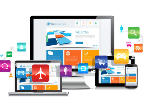
Make it mobile-friendly
It’s a new reality that not all – or even most – of your site visitors will be browsing from their desktop computer. Now, many online users are finding websites through mobile. Marketing for mobile is just as important as marketing for PC users.
You need to ensure that your navigation is friendly for mobile and tablet users, and one way to achieve that is by making your website responsive. This means it will resize automatically to suit the dimensions of the device someone has found it on.
Responsive websites improve conversion rates and look set to continue to grow in use alongside exploding mobile popularity across the world.